Let's Build a Smarter Planet.
In the late 2000s, IBM made one of the most consequential strategic bets in modern brand history - walking away from the product marketing playbook entirely and repositioning itself as a force capable of solving the world's most complex systemic problems. This is where that bet was placed.
The Strategic Pivot
For most of its history, IBM marketed products: hardware, software, services. The brand had built enormous credibility in enterprise, but that credibility was narrowly held - by CIOs, procurement teams, and boardrooms. The world beyond the enterprise had little reason to care.
The Smarter Planet campaign changed the terms of the conversation entirely. Rather than asking what IBM could sell, it asked what IBM could solve. The answer covered nearly everything: energy, transportation, healthcare, water management, food safety, retail, education, public safety, finance. If a system existed, IBM could make it smarter. And the world needed that - urgently.
The central argument was simple and bold: the world's systems were becoming more interconnected and data-rich than ever before. That created both a problem and an opportunity. IBM had the intelligence to turn that data into progress. The campaign's invitation to the world: Let's build a smarter planet.
The Visual System
The strategic ambition demanded a visual language equal to it. The solution drew from IBM's own design heritage - specifically Paul Rand's iconic work for the brand, and most pointedly his celebrated "wink." From that DNA, a new family of Smarter Planet icons was developed: one for each domain, each one a self-contained world.
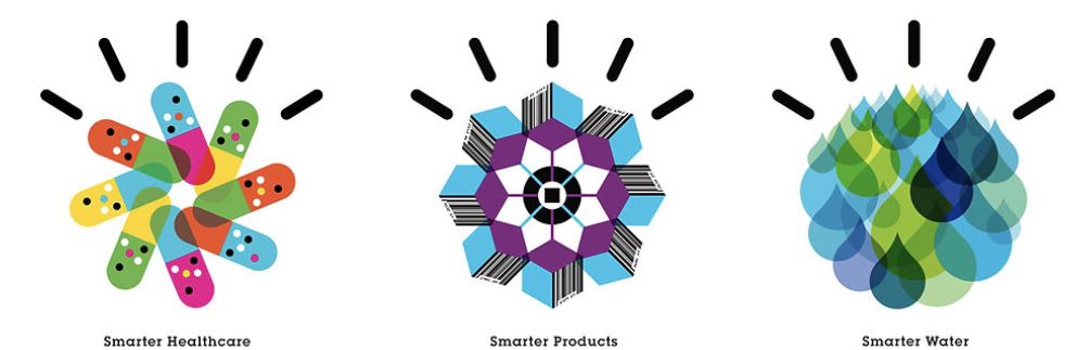
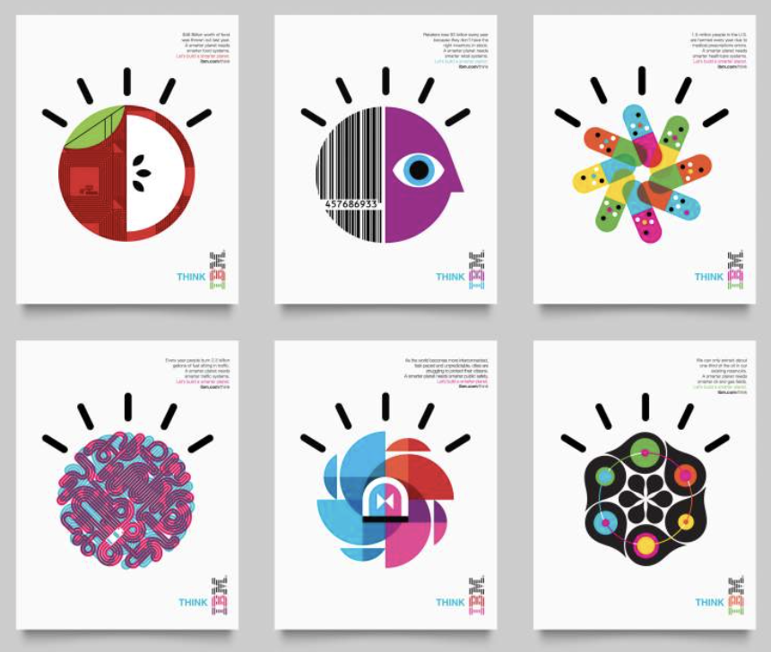
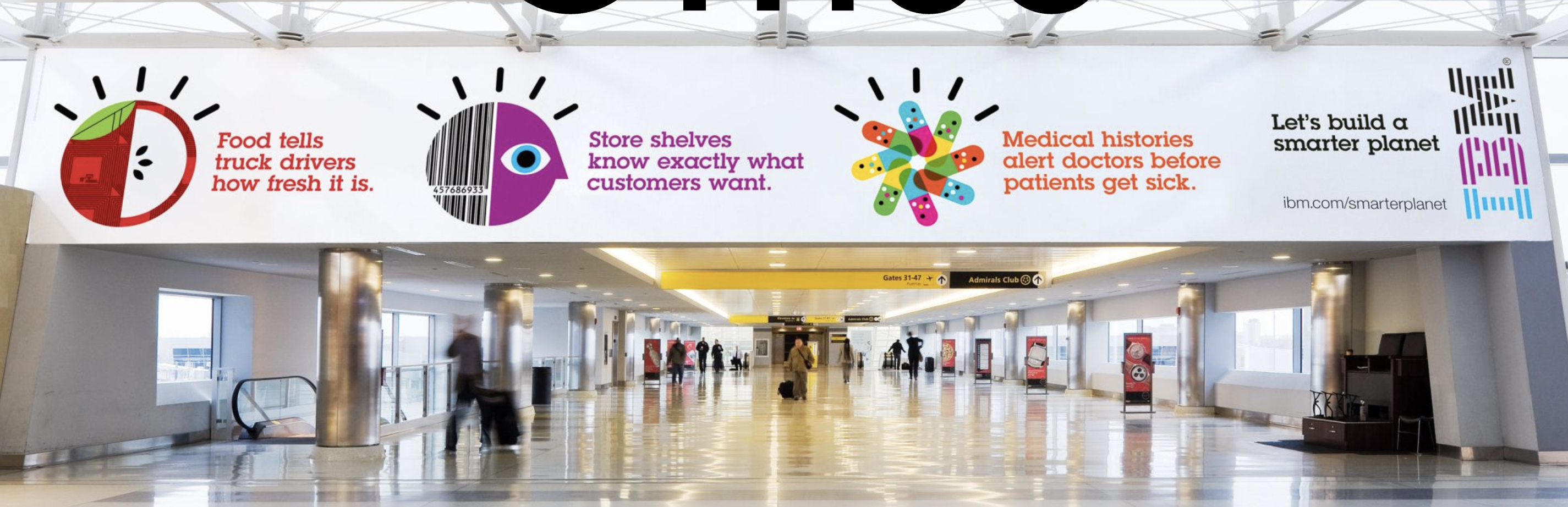
The icons were designed to be as provocative, vibrant, and visually arresting as the ideas they represented - yet simple and universal enough to communicate instantly across cultures, languages, and formats. An apple cross-sectioned to reveal circuit board logic. A barcode fused with a human eye. Capsules arranged in a starburst of interconnected care. A globe of tangled traffic rendered as pure kinetic energy.
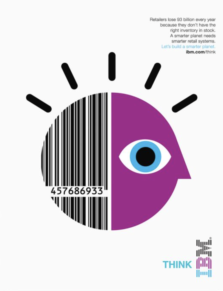
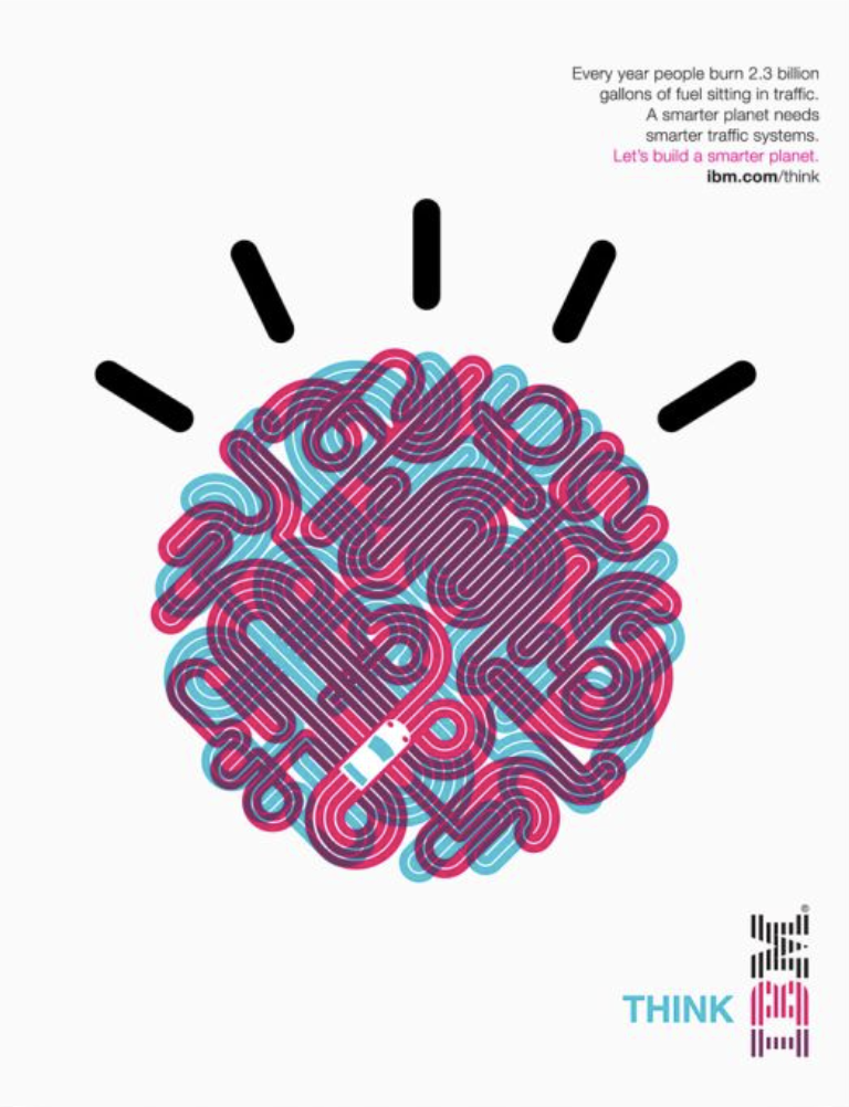
Each icon lived inside IBM's iconic "thinking rays" - the mark that had defined the brand since the Rand era - grounding every new idea in a century of institutional authority while simultaneously projecting a radically forward-looking vision.
The Scope
Twenty domains. Twenty icons. One coherent platform. The campaign addressed everything from smarter oil fields and smarter finance to smarter cities and smarter cloud computing - with each execution pairing a data-driven human truth with its corresponding icon.
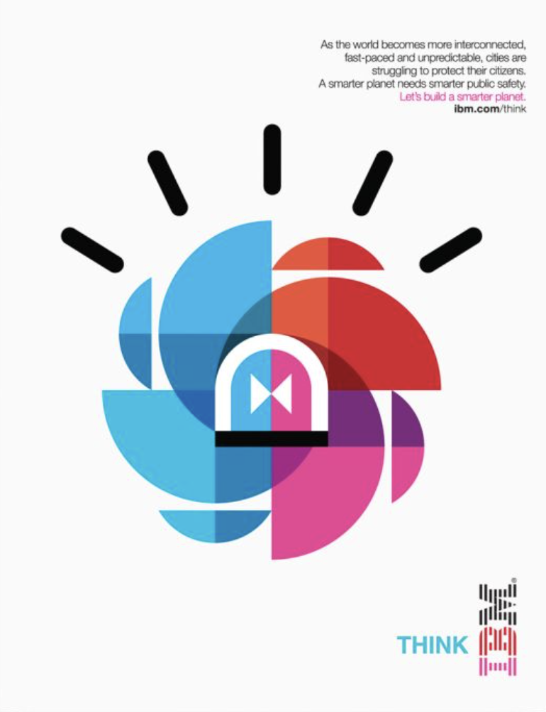
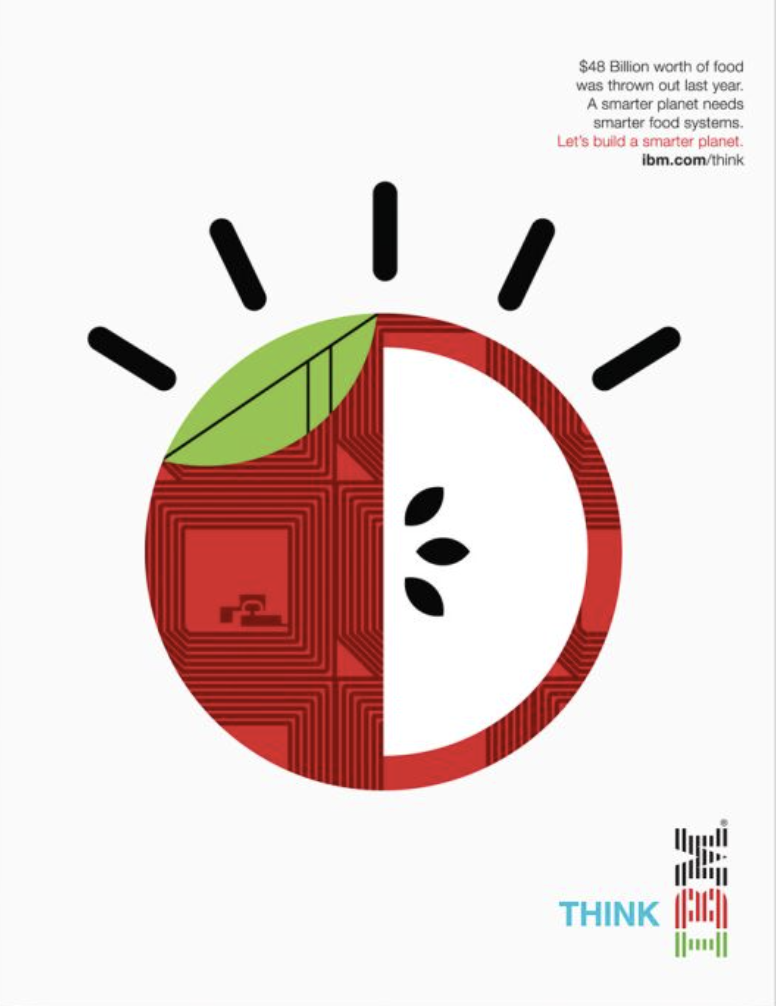
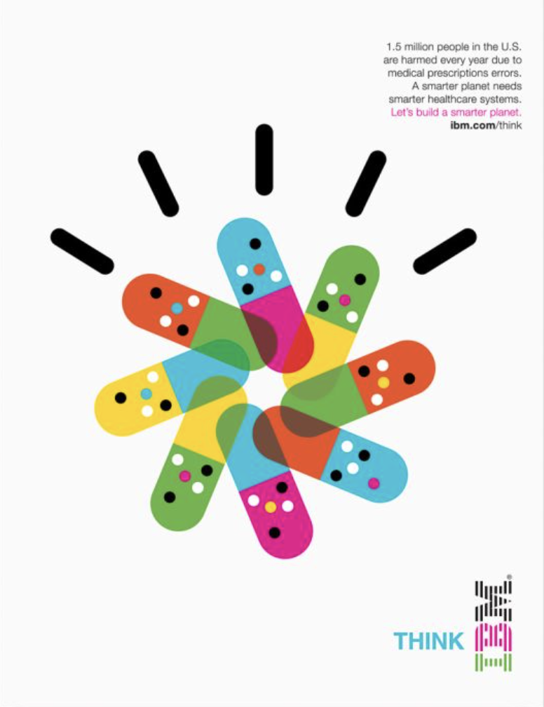
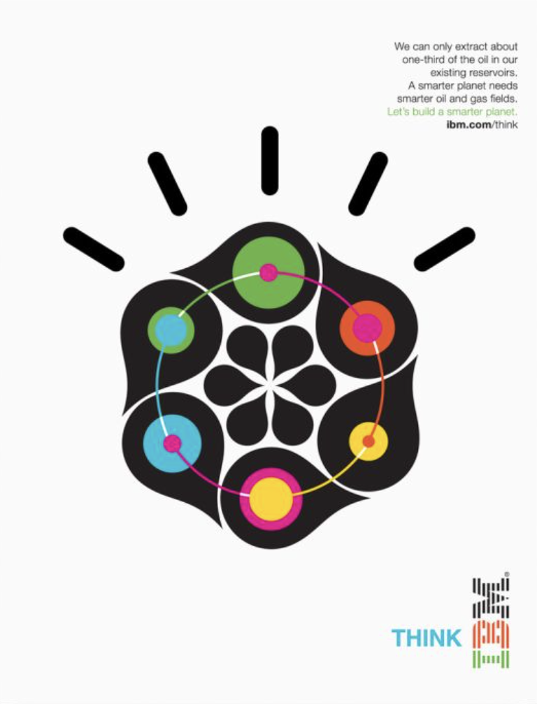
Every execution followed the same structural logic: a statistic that made the problem undeniable, a clear statement of what a smarter planet requires, the call to action - Let's build a smarter planet - and a single icon that made the abstract tangible. Retail. Traffic. Healthcare. Oil. Public Safety. The world's hardest problems, made to feel solvable.
At Scale
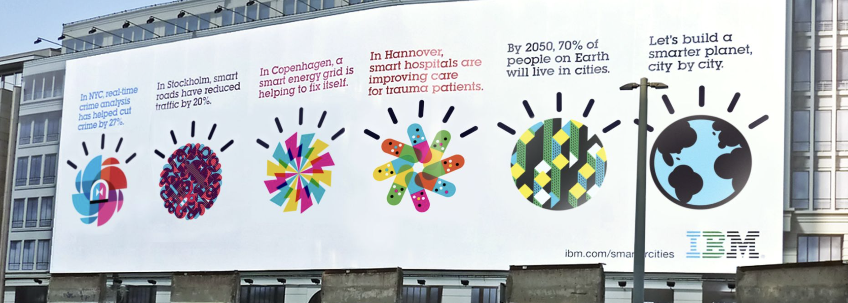
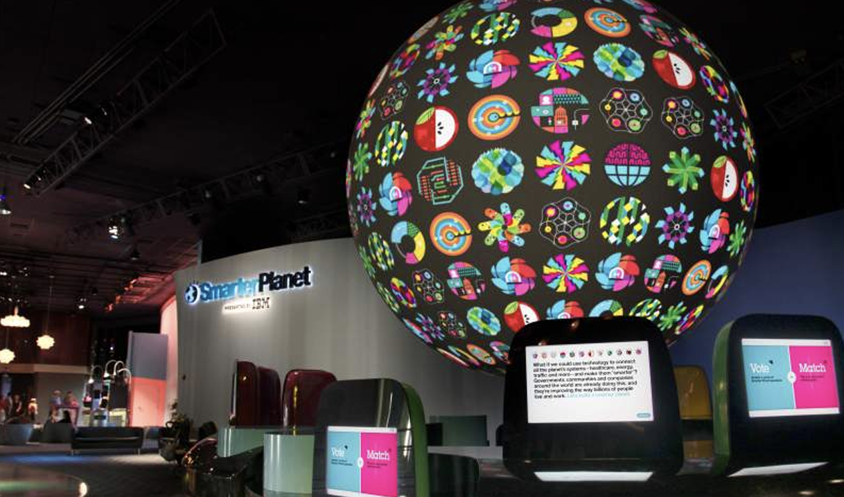
The visual system was built to work everywhere - and it did. Outdoor boards across global cities ran the icons alongside local city data. Airport corridors turned the campaign into an ambient environment. And at CES, IBM anchored the platform's centrepiece: a full-scale illuminated globe covered in every icon in the system - a literal representation of the smarter planet idea, rendered in the round.
The Proof
The most compelling measure of the Smarter Planet platform isn't an award or a media impression - it's longevity. Launched in 2008, elements of the campaign remained in market for well over a decade. The icon system became part of IBM's global brand identity. The "Let's build a smarter planet" line entered the lexicon of business strategy conversations far beyond advertising.
IBM's repositioning from technology vendor to strategic partner - from product company to ideas company - was one of the defining brand moves of the era. Smarter Planet was the campaign that made it real.
It also seeded everything that followed. Smarter Cities took the platform into the street and made it functional OOH - winning a Cannes Grand Prix in the process. Smarter Outcomes brought in artist Noma Bar to translate the platform's ideas into pure visual poetry. The platform didn't just last. It grew.